May 29, 2015
Dear Data Two | Week 6: Physical Contact
Alteryx
,
Dear Data Two
,
elevation
,
exercise
,
map
,
physical contact
,
routes
,
steps
,
strava
,
workflow
No comments

What an amazing week for me for Dear Data Two! The topic for week 6 physical contact and I've been learning Alteryx. The first thing I thought of was physical activity, not physical contact, so I emailed Jeffrey and asked him if he was ok with me taking such liberty on the topic. Fortunately Jeffrey was ok with my idea, but then I decided I could stick to the original contact by extending my thinking a bit.
I'm a huge quantified self data collector, which you'll likely see throughout my Dear Data Two work. I wanted to see how I could use Alteryx to help me get the data into Tableau for analysis before creating my analogue version because I feel like the best way to learn a new tool is to find a practical application. This is the first workflow I built on my own in Alteryx. It might not be the most elegant or most efficient, but I sure did learn a lot along the way. You can download this workflow here.

One of the things I have started to like the most about Alteryx is that I can push all of the complicated row level calculations that I used to do in Tableau to Alteryx, which in the end makes Tableau much faster. For example, I used to multi-row tool to calculate the distance between two geographic points recorded by my watch.
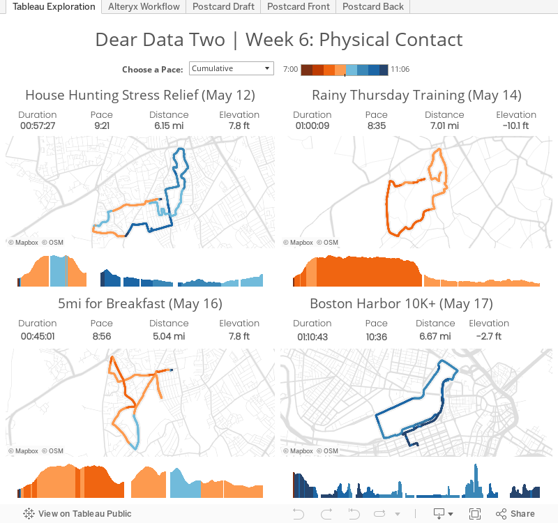
From there, I created the dashboard below to explore the data. In particular I wanted to view the maps and see the summary stats. One thing I learned is that I need to figure out a way to account for times that I paused my watch; that data doesn't appear in the GPX files.
Exploring the data Tableau helped me quantify my runs for the week, but that didn't account for all of my physical activity for the week. To capture ALL of my activity:
That resulted in this draft, which is sort of like a dot matrix:


I'm a huge quantified self data collector, which you'll likely see throughout my Dear Data Two work. I wanted to see how I could use Alteryx to help me get the data into Tableau for analysis before creating my analogue version because I feel like the best way to learn a new tool is to find a practical application. This is the first workflow I built on my own in Alteryx. It might not be the most elegant or most efficient, but I sure did learn a lot along the way. You can download this workflow here.

One of the things I have started to like the most about Alteryx is that I can push all of the complicated row level calculations that I used to do in Tableau to Alteryx, which in the end makes Tableau much faster. For example, I used to multi-row tool to calculate the distance between two geographic points recorded by my watch.
From there, I created the dashboard below to explore the data. In particular I wanted to view the maps and see the summary stats. One thing I learned is that I need to figure out a way to account for times that I paused my watch; that data doesn't appear in the GPX files.
Exploring the data Tableau helped me quantify my runs for the week, but that didn't account for all of my physical activity for the week. To capture ALL of my activity:
- I noted my total daily steps from Fitbit.
- I calculated the number of steps for my runs by taking my stride rate of 184 strides per minute from TomTom and multiplying by the minutes I ran in Strava.
- I subtracted my running steps from the total steps to get my walking steps.
- I used the time of day that I ran and roughly calculated the proportion of walking steps before and after each run each day.
That resulted in this draft, which is sort of like a dot matrix:

For the final version, I colored the dots: Blue dots represents 200 steps walking and red dots indicate 200 steps running. I rounded the numbers for drawing purposes.

You can view the images in the Tableau dashboard above as well, but note that as you're exploring the dashboard, when you click on the tabs that contain images, they will take several seconds to load. I've reported this bug to Tableau.
I really learned a ton this week thanks to Dear Data Two because I found a great use case for Alteryx. Not only did I learned a bunch of Alteryx tools I hadn't learned in the training I took at Inspire15, but I also learned how to do row-level calculations in Alteryx and how those can help Tableau performance.
Subscribe to:
Post Comments
(
Atom
)


No comments
Post a Comment